A Women’s Step-by-Step Guide to Using Health Insurance
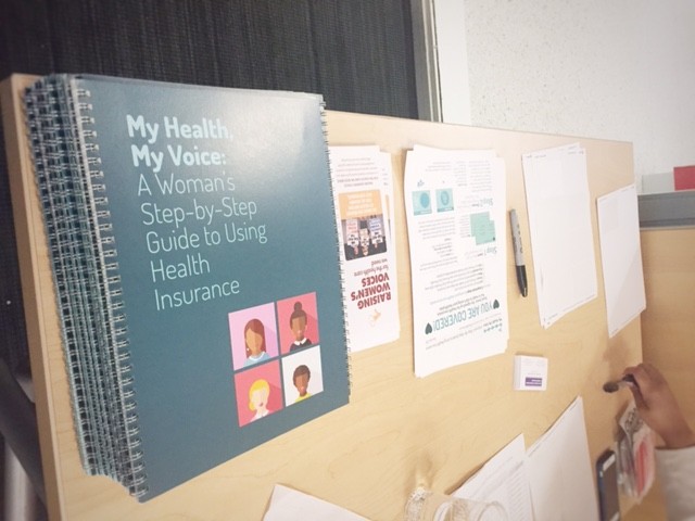
Raising Women’s Voices (RWV) launched a national campaign to help newly-insured women use their health coverage to get the care they need, while avoiding unexpected costs. The Centerpiece of this campaign is a new resource, “My Health, My Voice: A Women’s Step-by-Step Guide to Using Health Insurance.”
The Problem:
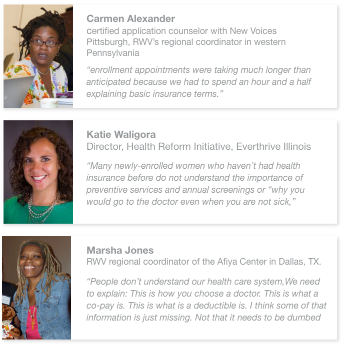
More than 4.3 million women gained health insurance coverage during the first round of open enrollment that ended back in April 2015. However, many of those newly-insured women are now confronting a new challenge — understanding how to effectively use their new coverage.
Objectives for our literacy project: “Teach 3 main things: How to get care using your insurance. Why to start using preventive services. How to avoid unexpected costs. Make it simple! Use graphics to increase understanding. Increase women’s confidence levels. Something women will take home and use as a resource. Something beautiful!”
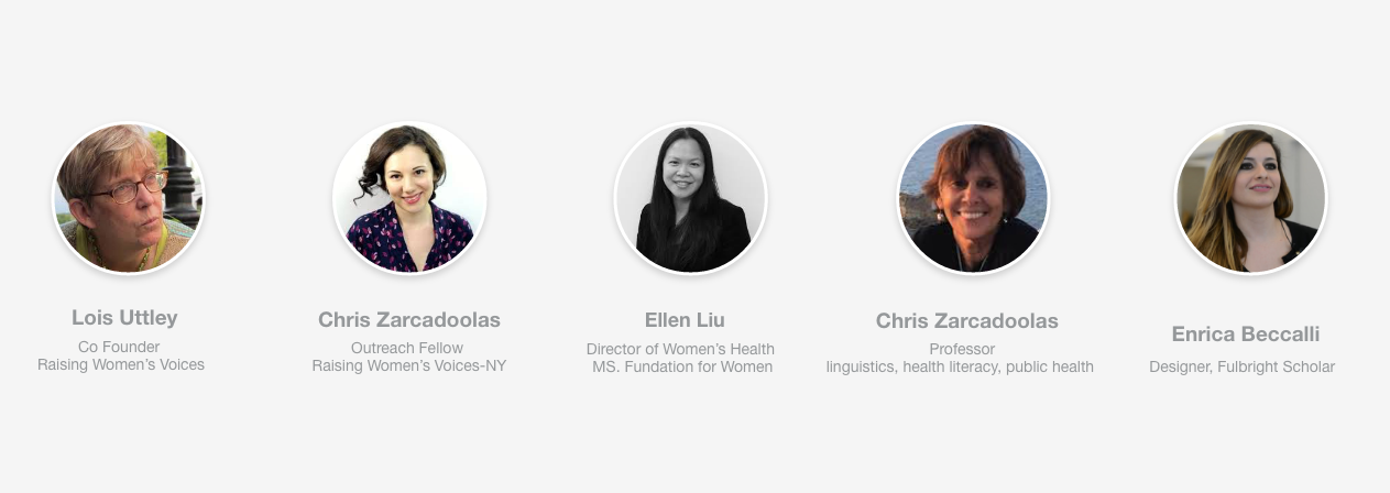
The Team
User Research
When I was selected to work on this project by the MS Foundation for Women, I was taking my second Master in the Design and Technology program at Parsons School of Design, where I had a passion for integrating technology into my work. However, as I analyzed the product’s goal and target audience, I realized that focusing solely on technology this time would not be the best approach.
Considering the age and gender of the target audience, I thought that technology usage could be a significant barrier. I myself come from a country, Italy, where the digital gender divide is prominent, and as a designer and feminist, I felt a responsibility to take this into account.
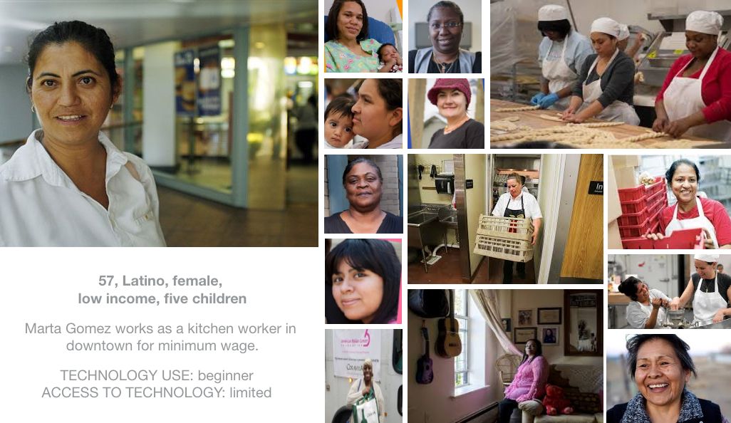
Therefore, I considered it crucial to approach the project with sensitivity to the specific needs and limitations of the people who would use the product. By directly learning from the community that the product aimed to support, we gained valuable insights and knowledge, often overlooked. This allowed us to develop an inclusive and accessible solution that addressed the challenges related to technology and the digital gender divide with empathy and understanding.
The Idea
Women tend to be the ones who take care of the health of the entire family, so thinking about my mother, I remembered that one time I asked her if I had a certain disease when I was a kid, and she said “wait let me go take “The Book” and check if your name is next to that disease”.
In that exact moment I realized that in my mom’s behavior there was something meaningful to take inspiration from. She used to keep an old diseases book to track of me and my brother’s infective diseases. Even if she uses technology for everything, she relied on a physical book for this kind of things. And if you think about it, the technology changes fast, phones get often lost and all the data goes with it. But a book most likely will stay in a room, on the same shelf, for a very long time. Moreover, a book is something that can be lent to somebody or pass on to.
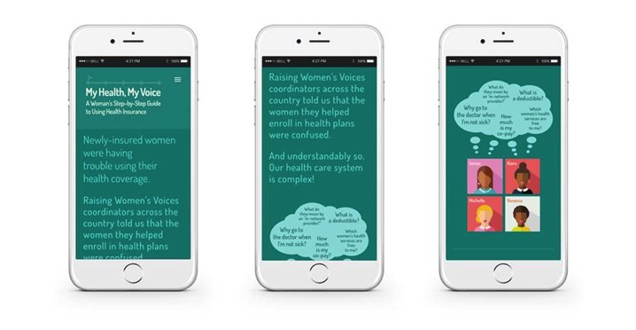
That’s why I made the conscious decision to create a tangible guide as the foundation of this product instead of a phone-app at leaset as a first step (it later became also a mobile app). Our team embarked on the development of a physical guide to address the specific challenges faced by newly-insured women when utilizing their health insurance. These challenges were identified through the invaluable insights provided by Raising Women’s Voices coordinators across the country. Some of these hurdles include:
- How do you find a Primary Care Provider (PCP) who is in your health plan’s provider network?
- How can you start using your health coverage, even when you have a big deductible?
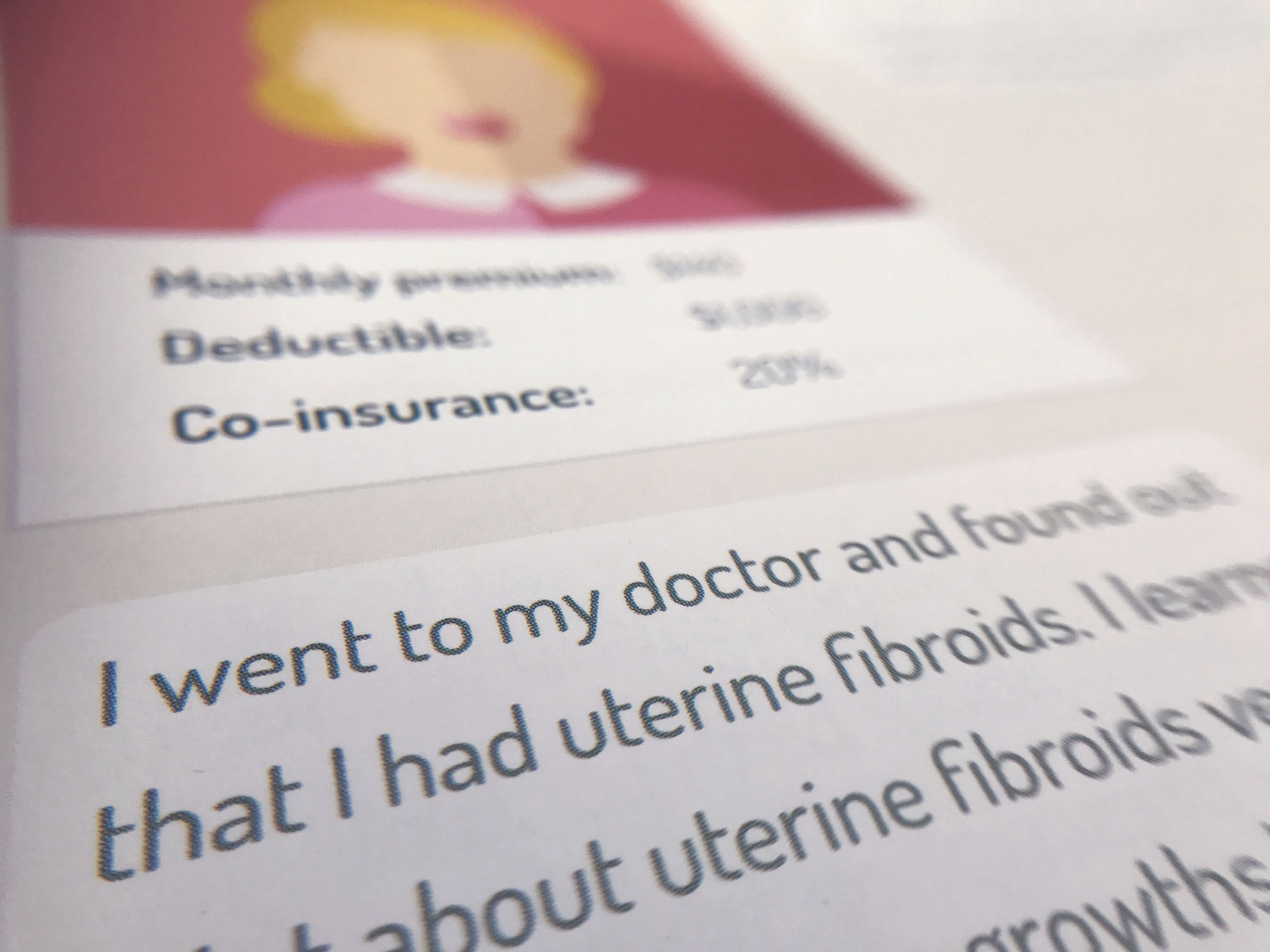
- What do all those terms like premium, deductible, co-pay and co-insurance mean?
- What are the women’s preventive services you can get for free, with no additional co-pays?
System Design
Thinking not only about my mother’s behavior but also about the tendency of women to keep a diary, especially a pregnancy diary, I thought that this product could incorporate various items within it and interpret women’s health as a journey that covers different life stages, various needs, and different family members, thus creating a go-to product for the whole family. So, I designed a small ecosystem of paper-based products. The core of my approach has always been to delve into behaviors and contexts to design meaningful products.
The product included:
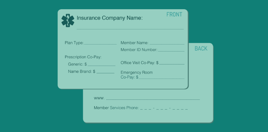
1. A step-by-step guide to getting started using health insurance. This guide will explain what information is on an insurance ID card, including the phone number for member services and the co-pay amounts for office and ER visits and prescription drugs. It will also help women learn how to find a doctor who is in their health plan network and make an appointment for a primary care visit to obtain key preventive health screening and services.
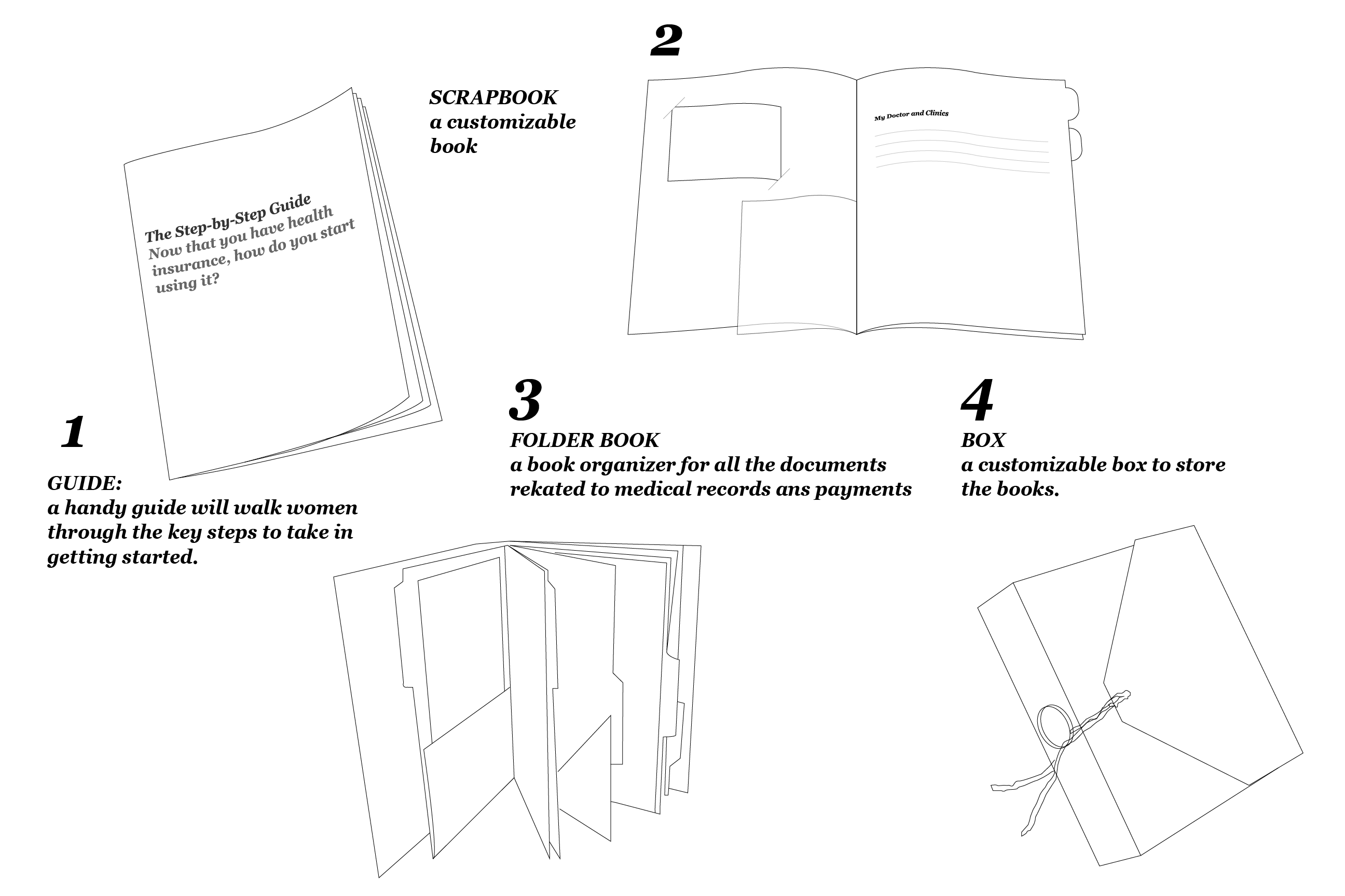
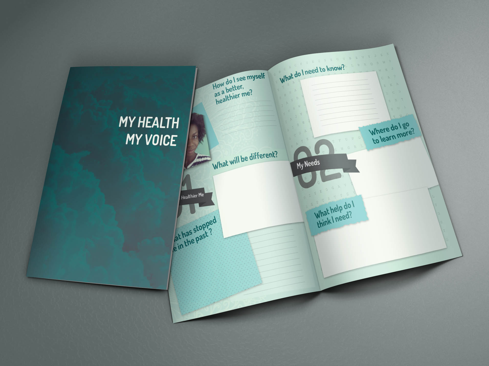
2. A personal health journal/workbook that will help women explore their vision of “a better, healthier me” and identify the help they need to work toward their vision of wellness. The goal is to empower women to believe their health matters and to gain confidence in navigating the health system. There will be places for women to paste in their own photos, stickers or decorations and write in their thoughts.
3. A folder to store important health insurance and medical records for safekeeping and easy access when needed.
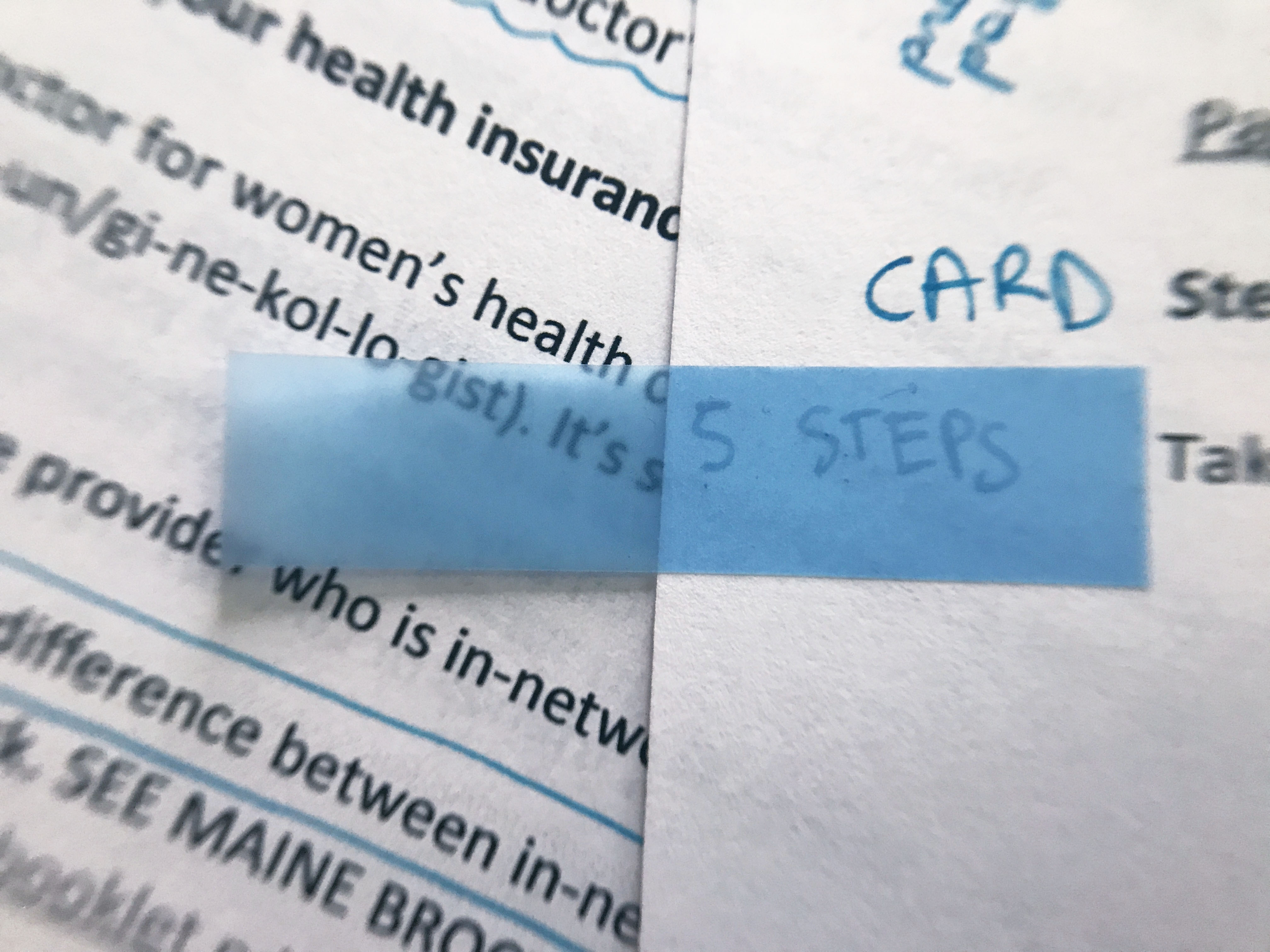
The Guide Covers: 5 steps to getting the care you need List of free women’s preventive services 4 types of costs you may have to pay: Premium Deductible Co-pay Co-insurance
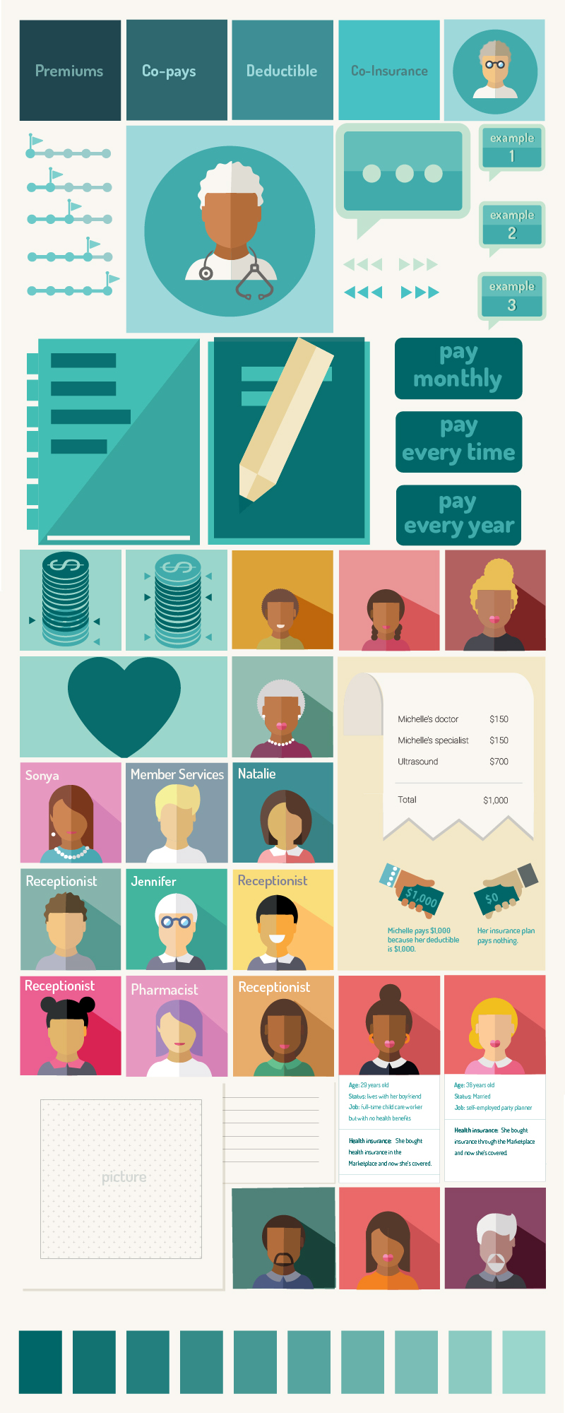
The color palette
“Women appreciated the colors, the graphics, the multi-cultural illustrations. They were glad they got to take them home!”
“The tonality was appreciated.”
One of the key objectives of this product is to promote inclusivity. It was essential for me to be mindful of avoiding stereotypes, and I recognized that colors can be a powerful medium for reinforcing them. Therefore, I diligently focused on details that would align with this vision, such as employing a diverse iconography and consciously opting for a non-stereotyped color palette. Instead of using the traditional pink often associated with gender stereotypes, I chose a more inclusive color, such as turquoise, to ensure that the product appeals to a broader audience without perpetuating any preconceived notions.
Step 1: Learn what’s on your insurance card Your member ID # The member services telephone number to call with questions. The co-pays for office visits, the emergency room, prescription drugs
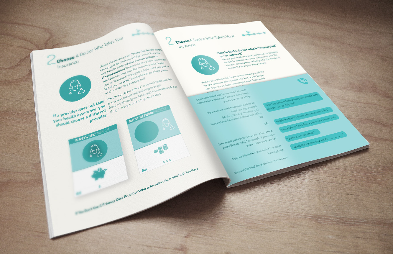
Step 2. Choose a primary care provider who takes your insurance.
Step 3. Make an appointment to see your new primary care provider right away.
Step 4. Be prepared for your first visit to your new primary care provider.
Step 5. Visit your primary care provider and take follow up action.
Can Books Embrace Interaction Design Principles?
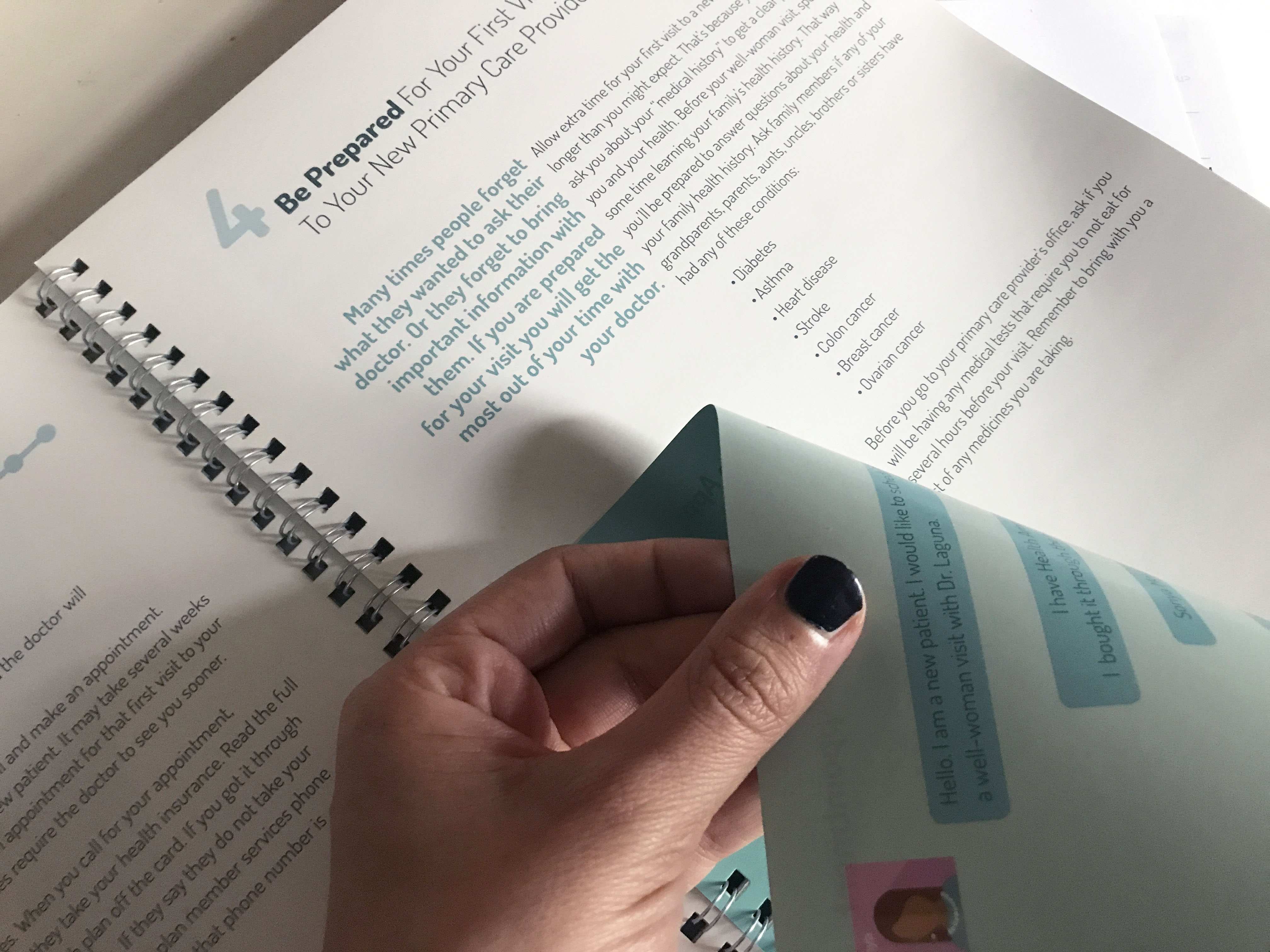
Even though I had decided not to design a digital product, it didn’t mean that I couldn’t draw inspiration from the opportunities that digital technology offers, such as the ability to provide contextual depth through buttons, modals, and hyperlinks. None of these interactive features are possible on paper, or perhaps they are? I wanted to challenge this notion, so I designed the booklet in a way that offers a multilayered reading experience. I envisioned two reading paths that could be explored simultaneously or individually. Let’s see how:
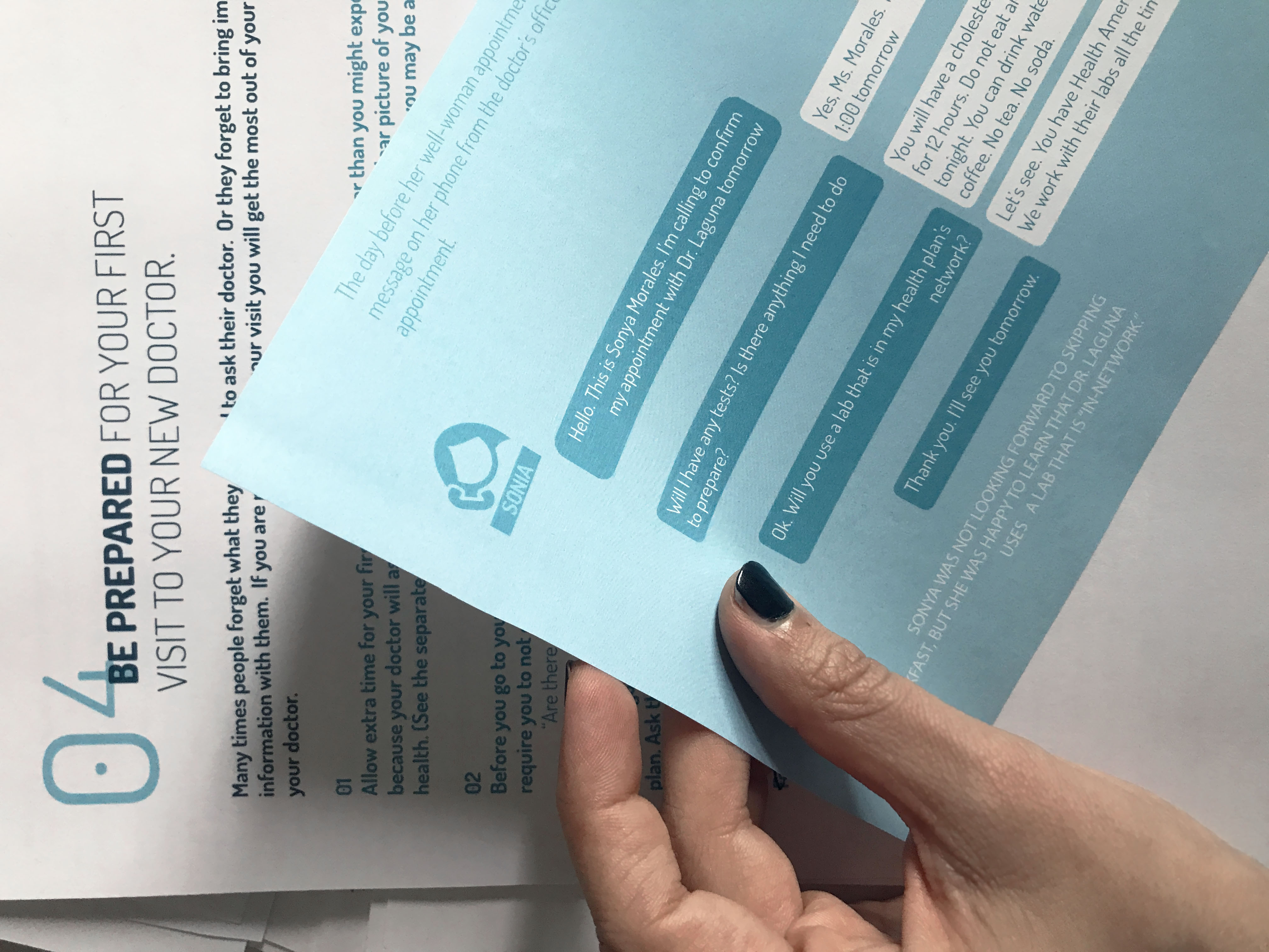
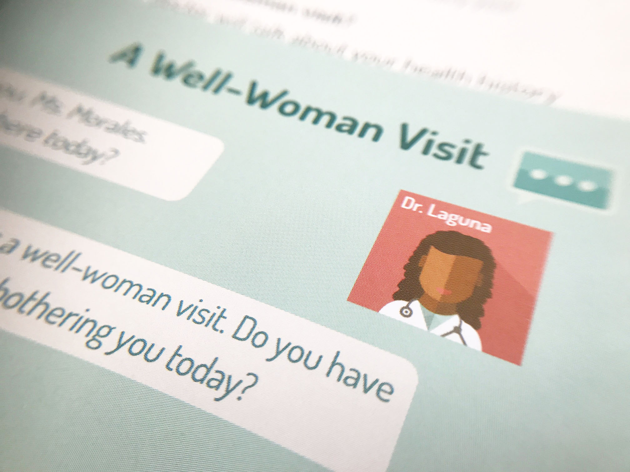
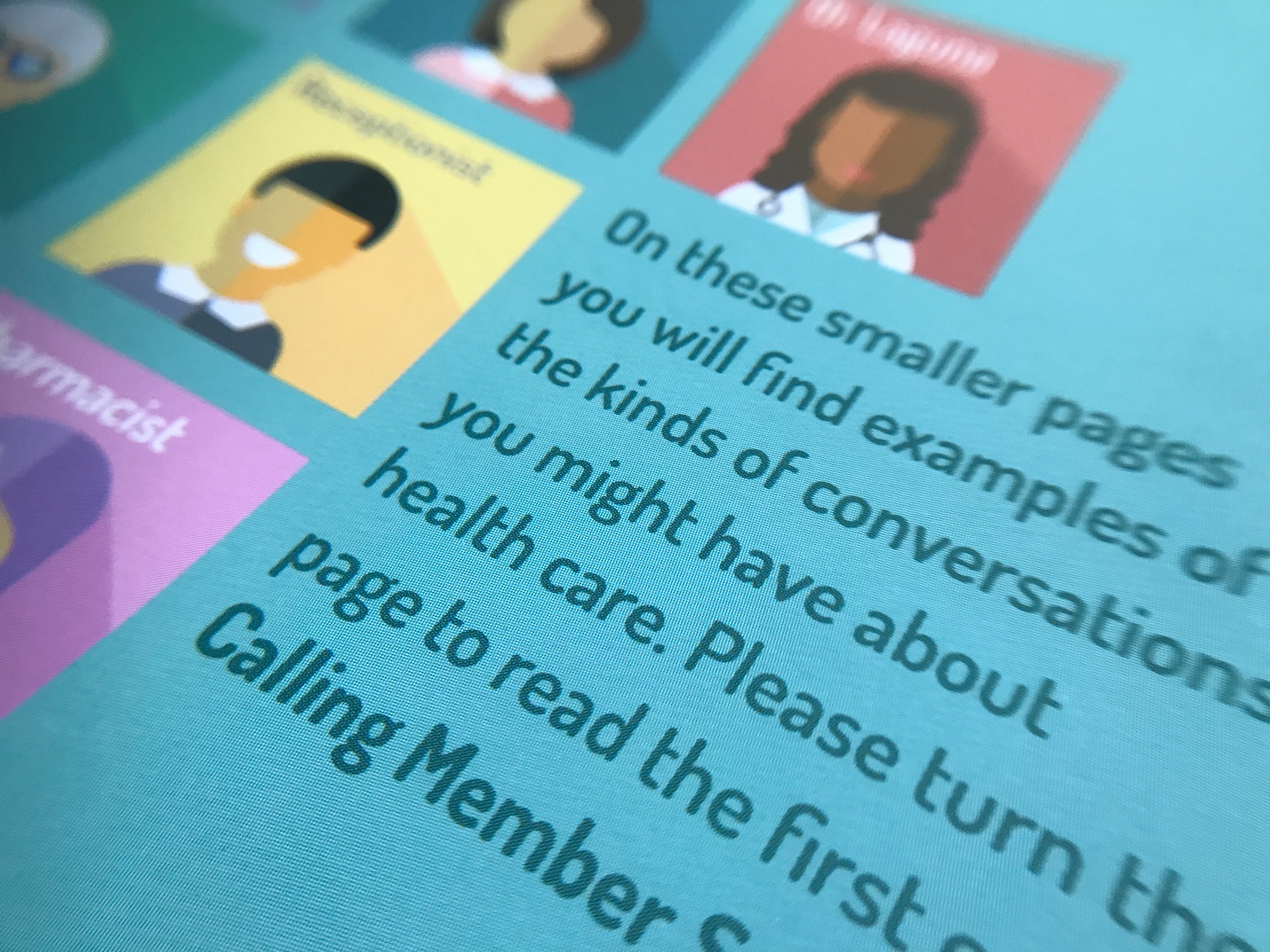
I alternated pages of different sizes to facilitate contextual explorations without burdening the content of a single page. Thus, I added small pages that provided in-depth insights through practical dialogue examples. These dialogues are small pages that appear next to a concept. This approach creates a multilayered and dynamic information experience. Some people require examples, while others may not. By presenting all the examples in small pages, users have the option to skip them or focus on them as they prefer. The design of this guide aims to maximize user experience and avoid overwhelming the reader. Surprisingly, these small pages turned out to be the most beloved part of the guide.
Throughout this process, it became evident that interaction design principles can be effectively adapted to enhance the usability and engagement of tangible analogic products. This realization adds a new dimension to my design practice, reinforcing the importance of versatility and user-centered thinking across various mediums.
“Examples are an effective teaching tool. Serve as a reference point for beginning a conversation. Give women with limited English proficiency the right words to use”
Empowering Access: Unraveling Health Insurance Through Scenarios and Personas
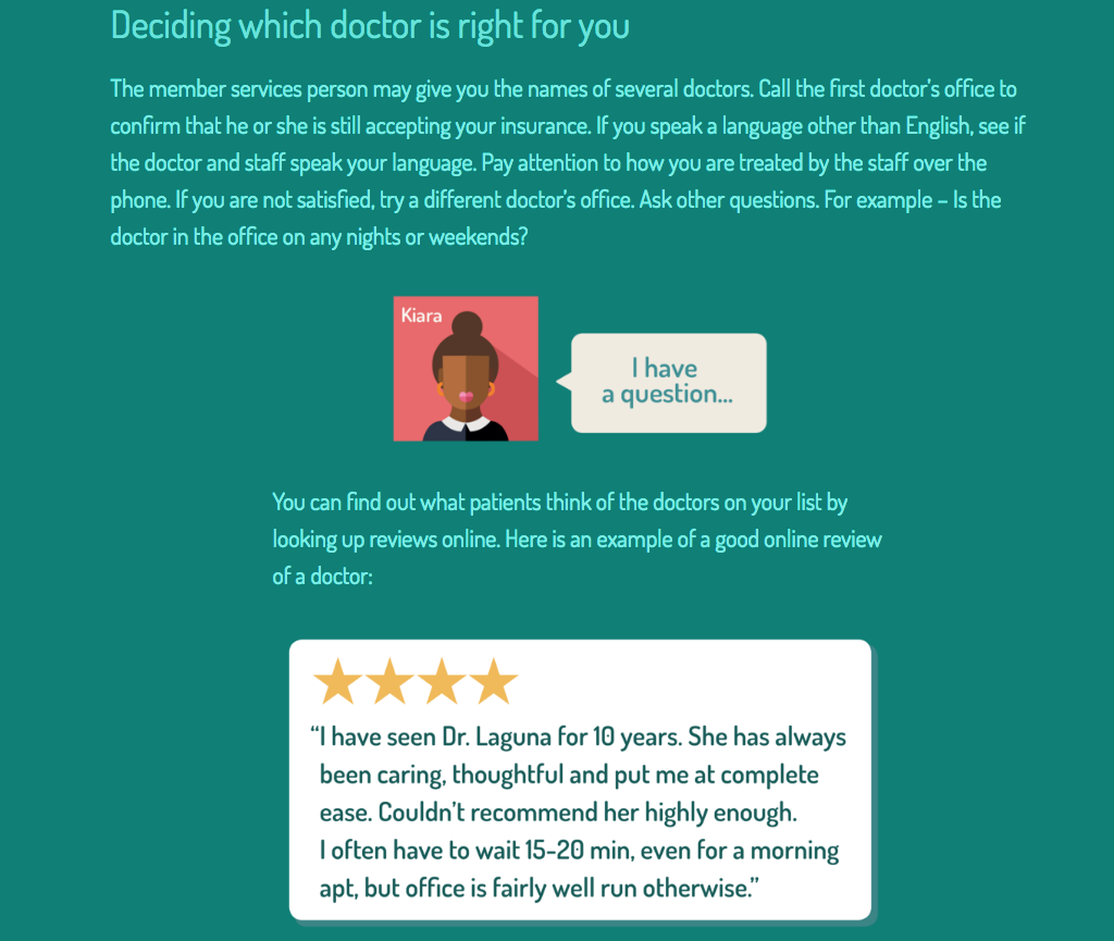
My personal experience as a non-native speaker moving abroad with little knowledge of the English language made me acutely aware of the challenges faced when trying to book an appointment with a language barrier. I recognized how intimidating it can be, and I worked closely with language expert to provide examples of dialogues that readers could confidently use in such situations.
In the design of this booklet, the presence of linguistic and health literacy experts was paramount. Accessibility was not solely a matter of layout or illustrations but also extended to the textual content. In fact, the guiding strategy was to create scenarios and personas that readers could relate to. I wanted readers to be able to find to even using the text from the examples to schedule appointments or seek information.
We field tested our materials
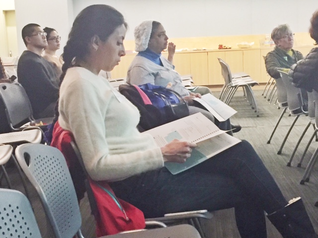
Raising Women’s Voices regional coordinators in 14 states (CA, CO, GA, IL, LA, ME, MD, MI, NY, OR, PA, TX, WI, WV) tested the materials with 121 women. Pre-workshop survey assesses baseline of knowledge. Post-workshop survey assesses whether women: Understand key concepts better, know how to refer to the guide at home for help, feel more confident about using their health insurance to improve their health, manage health conditions.
Who were the women in our field testing?
Some characteristics: Ages 19-64, average age of 36 Majority women of color 47% privately insured (the rest, Medicaid or don’t know) One quarter do not primarily speak English Low-income households: 31% with household incomes under $15k 40% between $15k and $40k
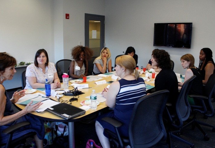
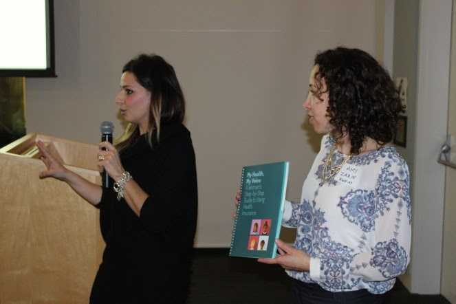
Workshop testing of the guide at CUNY School of Public Health in August 2015
User Quotes:
“Comprehensive but not intimidating”
“The design is a hit.”
“Women appreciated the colors, the graphics, the multi-cultural illustrations. They were glad they got to take them home!”
“The tonality was appreciated.”
“The examples on the small pages work well.”
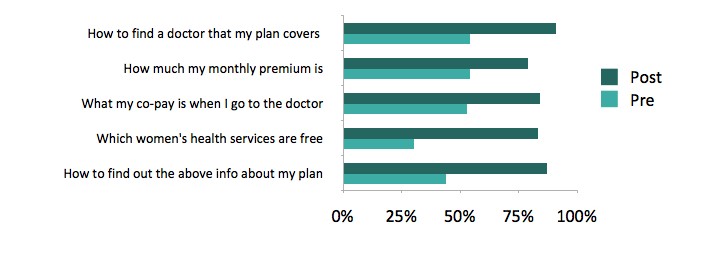
Result: Most participants gained confidence in their ability to understand and use their health insurance.
I feel confident/very confident I know:
GET A COPY HERE
For more, go to : http://www.myhealthmyvoice.com/
