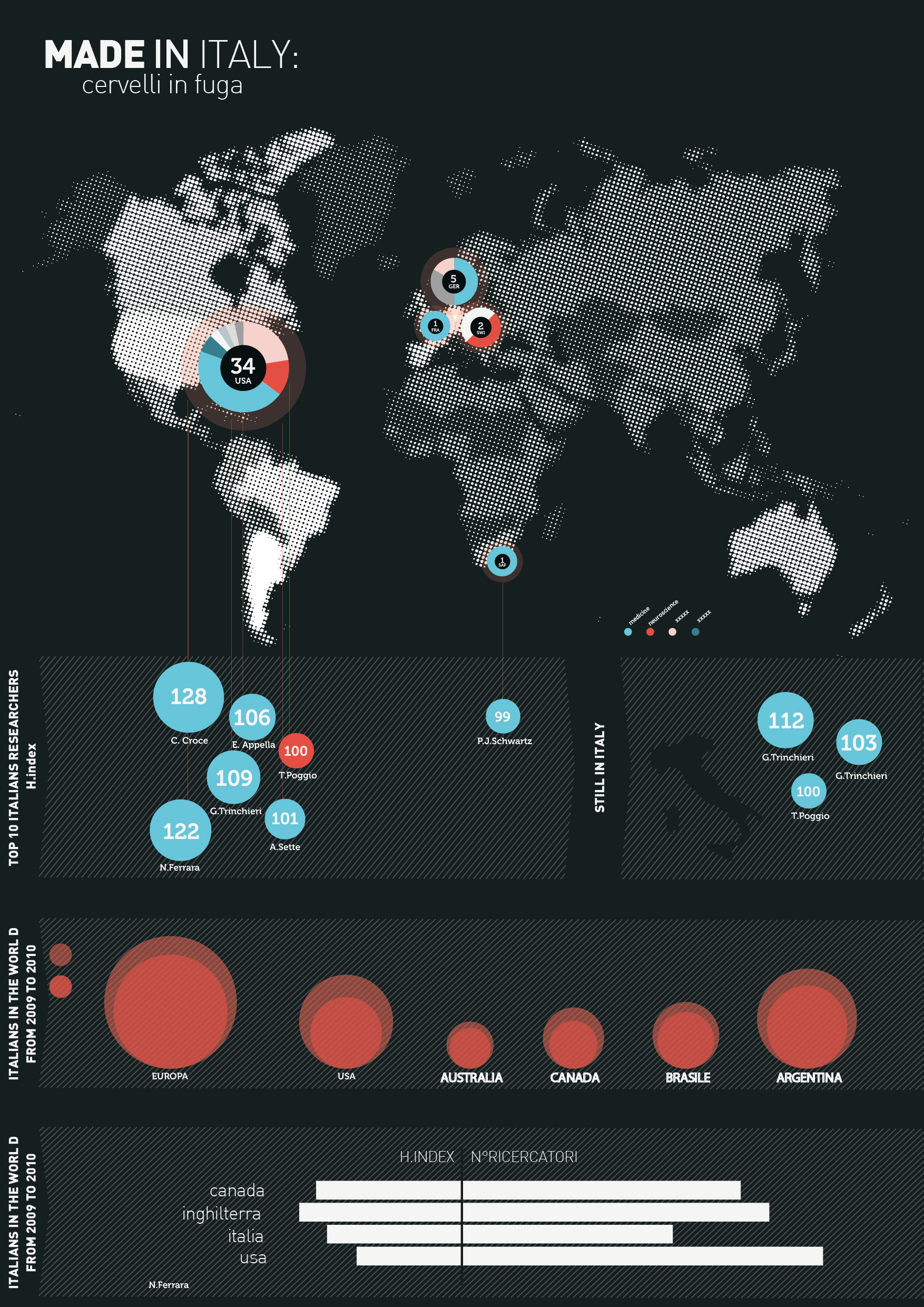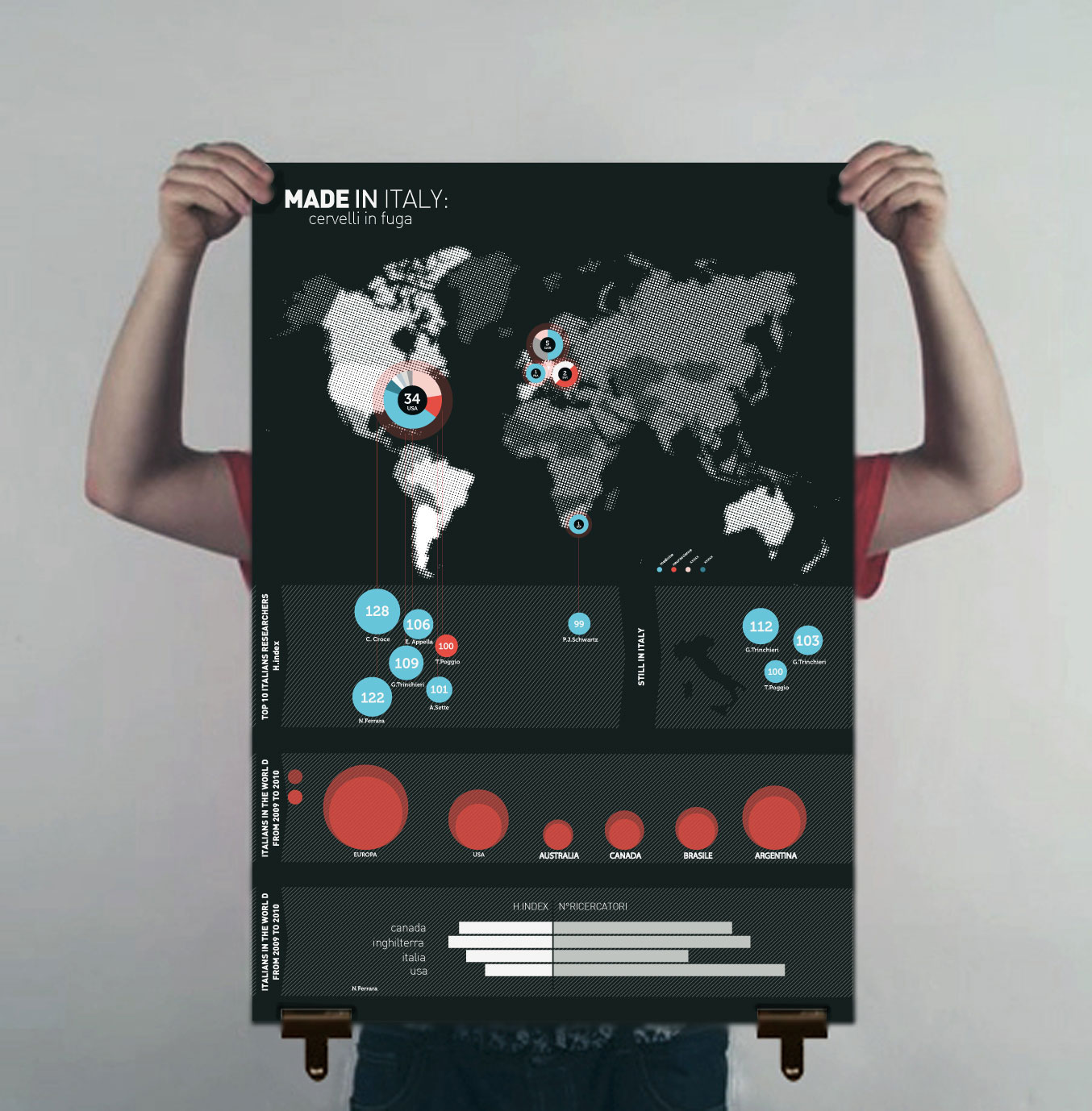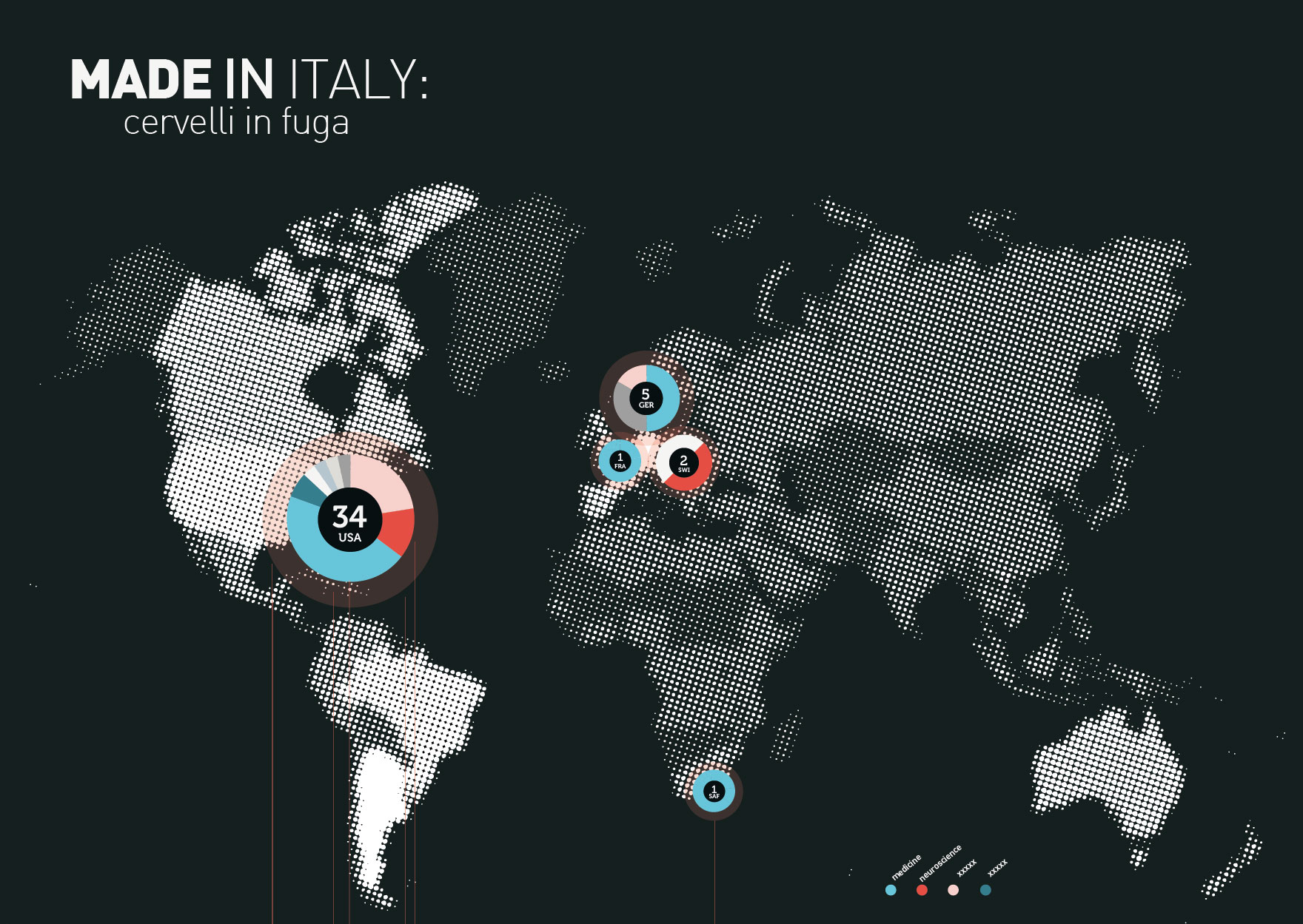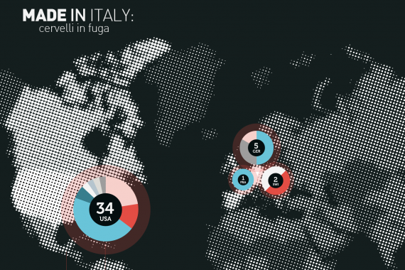
Made in Italy – Brain Drain
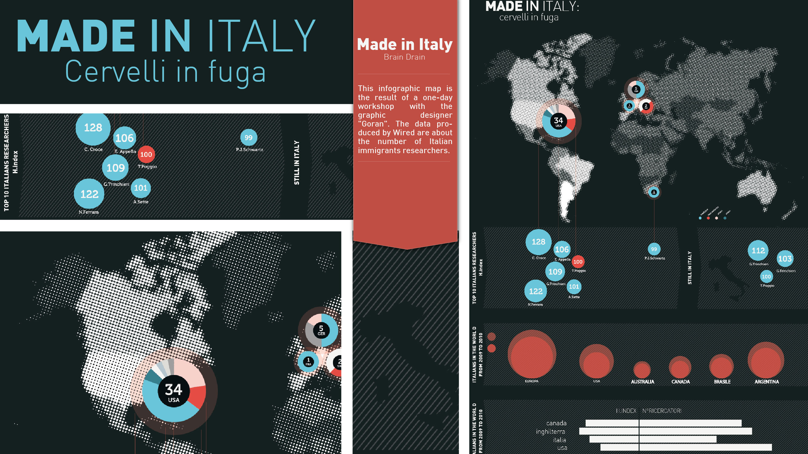
This infographic map is the result of a one-day workshop with the graphic designer “Goran”. The data produced by Wired are about the number of Italian immigrants researchers.
In this map the white dots represent the Italian emigration density, the pie charts represent the number of the Italians top researchers and the reaserch area in which they are studying or working. The map also shows the h-index of this researchers,The h-index is an index that attempts to measure both the productivity and impact of the published work of a scientist or scholar.